Tuesday 20 December 2016

First Draft


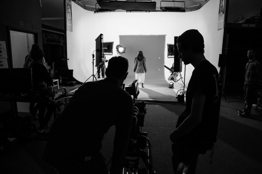
This is my first draft of my music video for Only Sun's "Get Away". I used a performing studio for my location to give the video a live feel which I have been researching about. I also used a black and white effect which I have also covered in my research. I like the look and the feel of my first draft very much but on my second draft I am definitely going to work on attempting to match the timing of my video to the track even better as in some points of the video it drops out as it is a live performance in the video. I am also going to construct a criticism sheet which i will hand out in my class when my draft is screened to see other areas I can improve on which I did not pick up on first glance. I provided a screening in my class to showcase my draft and these were my feedback results;

- Timing is off
- Should offer an alternate narrative to shape meaning
-Experiment with effects to give an edgy aesthetic

These three points are all something I am going to attempt for my second draft to improve my music video.

Friday 2 December 2016

Ancillary Task Poster


I have constructed my ancillary task poster for the band Only Sun. I decided to keep the poster simple whilst eye catching. The poster features a sleek and simple element to portray the simple message of the bands name in an attempt to gain more recognition. The abstract colours of the background image give a nice complexion to the standard white logo of the band in the foreground. The background features the frontman only. This is similar to that of oasis focusing on the frontman Liam Gallagher, giving a bigger presence for his lead voice of the band. The background depicts the lead singers passion for the lyrics, with his eyes shut and hands clutching the microphone.

Thursday 1 December 2016

Poster Analysis Summary

From the ten posters I have analysed, I have obtained some creative mindsets from the way posters are bordered to where the band logo is placed. The main thing I have picked up is how effective simplicity is in a poster. This is something I will definitely replicate in my own ancillary task. However, I have exploited some elements of complexity in some of the posters I have analysed. These are things I will not be attempting to re create for my ancillary task.

Tuesday 29 November 2016

Rolling Stones Poster Analysis


This is one of the most complex posters of them all. It features that psychedelic feel that rock had in the 60's. The way that the log is waved reinforces this feel to me personally. The use of many different colours and support artists add to the complexity and madness of this poster. This is definitely an accurate portrayal of their gigs back in the 60s.  This is a brilliant poster but not one i think I can recreate for my ancillary task.

Jake Bugg Poster Analysis

This is the promotional poster for the Jake Bugg Los Angeles performance. It features a street shot of Jake Bugg and his guitar, displaying the origins of his music and his raw originality. The poster has a rough urban feel to it, this is explored through his music also. The logo is imprinted towards the bottom of the poster in the centre line. This is another simple poster which I am inspired by. 

The Libertines Single Poster


This is the poster for the well known single "Don't Look Back Into The Sun" by The Libertines. The poster obtains a rough and edgy feel which definitely portrays the sound of the band. This is implemented by the tor image at the trop of the poster and typography being put on a slant. This goes against common codes and conventions of typical music posters. This has given me an alternate view to my ancillary task possibilities. 

Oasis Final Tour Poster


This is the last tour poster Oasis released before their split. It is for the "Dig Out Your Soul" Tour. It features a space rock theme, which is bizarre compared to the bands origins of indie rock. The logo is imprinted on the top of the poster in the centre line. The boarder of the logo is similar to that surrounding the dates and locations of the tours. The support acts are above and outside these boarders. The whole poster gives a complex and intricate to feel. I really appreciate this poster but I do not think I will be able to recreate it for my ancillary task. 

AC/DC Poster Analysis


This poster depicts how important and effective a border can be to a poster. The boarder adds a wholeness and frame to the poster, without it, it would not be any where as near effective as catching the audiences eye. The simplicity of this poster is yet a huge inspiration for me. The poster features a Gibson Sg electric guitar in all black in the centre line of the poster. This guitar is specifically renown for Angus Young's (Lead Guitarist) use. The lightning symbols on the fretboard shows that the guitar is Angus Young's Signature SG guitar. It is identical to that of the lightning bolt in the the bands logo. It is said to be one of the greatest symbols of Rock and Roll this guitar. The bands logo is simply printed largely at the bottom of the poster. 

Catfish and the Bottlemen Poster


This poster features an alternate perspective of a live performance by placing the point of view behind the band, somewhere where the crowd can not usually see. The logo of the band is imprinted largely at the top of the poster, in the centre line. It seeks to promote the tour and shows of the band which appear to be sold out. It also features information about social media pages linked with the band as well as where to purchase tickets. Additionally the promotion for the band's debut album is imprinted at the bottom of the poster. I really appreciate the black and white synergy this poster has created for Catfish and the Bottlemen products  across the board. The simplicity is also a great feature in my opinion.

Pretty Vicious Poster


This is another example of simplicity which I personally really take to. This band is a small band from Wales slowly gaining recognition for their brilliant music. Its black and white basic design for fills its basic purpose of informing the audience who the band are and they're tour dates. This is proving to be effective as these tour dates are selling fast. This is definitely something I would like to replicate for my ancillary task.


Oasis Knebworth Poster


This is a very complex poster, as so it should be with the shear scale of the gig that it is advertising.  Over the two nights the and played at this venue, they played to over a quarter of a million people, with 2.7 million ticket applications. This means that the poster has reached out to millions across the entire country, with only one member of the band on the poster. This emphasises the importance of the frontman being the face of the band. Im not sure if I am going to recreate the text in this way as the band Only Sun are obviously not playing any gigs of this scale unfortunately. I will take the frontman idea into consideration for my ancillary task.

The Stone Roses Poster


This iconic masterpiece portrays the brilliance of simplicity. All it features is the name of the band and the iconic lemon logo in which is symbolic of the band The Stone Roses. The boarder of the poster being the same colour as the name of the band (Black) is really effective in my personal opinion. It gives a sense of completeness and unity to the poster, symbolising the connection the fans and the band have between each other. I also like that everything is symmetrically centralised, giving a neat and clear finish to the product. This is something I would like to recreate for my poster.


Arctic Monkeys Poster


The classic black and white approach this poster has took is really effective as the colours contrast to make the logo of the band stick out. This simple sleek design is something I would like to attempt to replicate to achieve the same effect in my ancillary task of creating a poster. The simplicity is something that is really striking to me as a band such as the Arctic Monkeys who have achieved world wide success over the years have gone back to basics and haven't attempted to produce something really complex. The print for the album going across the middle creates synergy for all "AM" products including the album itself, creating brand recognition.

Sunday 20 November 2016

Animatic

This is my animatic I have made from my storyboard. It may be short but i'm certain it'll be effective!

Saturday 19 November 2016

Story Board


My filming location in the chosen studio I am going to film in are allowing me to place three cameras in three locations and let them record for the entirety of the song. This will then allow me to edit them together instead of using one camera and having to keep stopping and recording. Its only three shots a tilt shot, and two medium shots but i'm certain it will achieve the dynamic view i'm hoping for.

Tuesday 8 November 2016

Only Sun Get Away

I have decided with the band to create an alternate music video to their already released single "Get Away". There is already a music video for the single on the bands youtube channel, but we have agreed to create an alternate video so I can catch a personal angle and perspective of the track. My video will be more of a focus on the band rather than a story being told.

Wednesday 2 November 2016

Location

I have decided that my film location is going to be a stage, I believe that my music video should be like a show case of a performance of the track. I have explored the importance of giving a live feel in my previous research. I can either create my own stage in a warehouse I can hire out of my own expenses, or a studio. The studio will give a more original and personal feel and will allow me to gwet up close and personal with the band and their performance.

Tuesday 1 November 2016

Adobe Premiere

Adobe Premiere is the software I am going to be using to edit and produce my music video. I am ver familiar with this software as I used it to edit my video in last years task. This programme also lets me edit the audio easily to fit the shots of my video.


I am also going to use the software photoshop to construct my Digipak and my poster for my ancillary tasks. I am using this software as i am also familiar with it as i have used it very frequently over the past couple of years.


Evaluation Questions

1. In what way does your media product use, develop or challenge forms and conventions of real media products?

2. How effective is the combination of main and ancillary texts?

3. What have you learnt from your audience feedback?

4. How did you use new media technologies in the construction, research, planning and evaluation stages?

The four questions are the evaluation questions for which I will evaluate my main and ancillary texts. It is vital that I take these question into consideration to ensure my research and planning reflects my main and ancillary texts. I think question number four is the question I have to ensure I use throughout my blog so that i will be able to evaluate correctly and make it easier for myself.


Dig Out Your Soul Album Cover Analysis

Dig Out Your Soul is the final Oasis Album. The sound of the band has changed dramatically for this album. The front cover is very bizarre, featuring complexions of bright orange which is very effective in attracting the attention of the audience. There is a lot going on in the album cover. The two cradling hands connote care and delicacy which contrasts the volcanic explosions it holds. This contrast promotes the madness and exteriority the music of this album obtains, which is a really big change in Oasis's sound. The lyrics "come in come out" is a repeated lyric featured in the first single released for the album "Shock Of The Lighting", implying the strength of meaning portrayed through the song. The tsunami behind reinforces chaos and exteriority as the randomly placed items such as an upside down butterfly.  The back cover features a very bizarre hand painted font for the track list. This gives a very naturalistic feel to the track names reinforcing originality and gives a loose as well as a sparse feel. One thing to take into consideration is that no synergy is created as the oasis logo is not featured anywhere on the album, the first time in Oasis' history that they have released an album without their logo on it.


Digipak Analysis

From the 10 digipaks I have researched, I have heavily been inspired by simplicity. This is clearly evident throughout the album covers I have analysed. This is something I will definitely replicate in the creation of my own ancillary task. The placing of the band's logo is something I have taken into consideration and will also replicate in my own digipak.

Monday 31 October 2016

Don't Believe The Truth Album Cover Analysis

The front cover from "Don't Believe The Truth" is probably one of the most abstract front covers in the bands previous history. The shot of a wall with the tile across it is shot in a fish eye lens. This gives a more abstract and dynamic angle/view of the title of the album. This suggests that the band are taking on a different angle on their song writing. The black and white is similar to that of the previous album "Heathen Chemistry", creating a slight synergy between this and the previous album. The Oasis logo features the same position as the previous album, creating a larger synergy across Oasis products. The bak cover of the album features the track list in big bold spray paint like font. This puts a major emphasis on the songs, letting them speak for themselves massively.

Heathen Chemistry Album Cover Analysis

The "Heathen Chemistry" album cover features a bizarre blurry shot of the band in a metallic grey complexion. The lack of clarity in the image possible suggests the changes the band is going through. The shot is taking from a low angle tilting up, this reinforces that they are at the top of the music business. This feeling was also created in the last album. The logo placed in the top left corner is a mix between the font used on their previous album "Standing On The Shoulder Of Giants" and the black box around the traditional logo. This is creating a new synergy across Oasis products. The radiating lights over the top remind the audience of strobe lights used in live shows. This is one of the most basic album covers in the bands history and is yet still effective! The back of the album is even more simplistic featuring the colour black fading into blue slightly. This is a very basic back cover, meaning that they are letting the songs speak for themselves.


Standing On The Shoulder Of Giants Album Cover Analysis

This album was released in 2000 and signifies a turning point for Oasis. This is when the whole of the band began to change with Gem Archer and Andy Bell joining and the band started to have families and fully grew up. They're sound completely changed for this album. As well as sound, the logo across the top of the album is different to the past four albums, not creating that synergy the band had with all its previous products, symbolising that the band is moving in a different direction to start the mark of a new century. The album cover features the skyline of New York City, with the Empire State Building in the foreground. This implies that the band are sitting at the top of the music business and reinforces the size of the bands popularity. This is also reinforced with the title of the album. The mystique blue look is quite distinctive and iconic and stretches outside the box as this is a colour Oasis haven't yet slapped on an album cover.  The same skyline is featured but from a different angle on the back cover of the album. This is a very simplistic album cover but also very effective!


The Masterplan Album Cover Analysis

"The Masterplan" by Oasis is a collection of chosen b-side tracks collaborated into an album. The album cover features a distinct green look. The front cover features a classroom with a bunch of mature students, possibly suggesting that the band is going back to basics or the drawing board if you like. The front cover also reflects the title of the album as the students in a classroom appear to be learning about "The Masterplan". The album features the bands logo at the top of the board in the classroom, implying that the band are at the top, this reflects their popularity as at this point in time (1998) they became one of the biggest bands in the world. This also reinforces the synergy created across Oasis' products and albums. On of the desks towards the bottom right corner features a poster of their debut album "Definitely Maybe". This suggests that he band have not forgotten their roots and to display how far they have come. The back cover of the album features a shot of a live performance by Oasis. This reinforces their live presence and they're a good live act.


Tuesday 18 October 2016

Filming Tips and Processes

This video explained some of the concepts and ideas that I need to take into account whilst filming and editing my music video. This has caused me to think slightly differently about my filming session and that I need to plan further in preparation to utilise time!


Glide Camera

The Glide Camera is a piece of filming equipment i am going to use in the creation of my music video to obtain stable footage. I wish to obtain this to gain a professional and sleek look to my music video as it is going to represent the track and the band yo the audience. A glide camera also allows me to freely move with the camera whilst maintaining the stability of the footage. This will allow me to get a range of moving and panoramic shots for effect. This can be sped up or slowed down in the editing to create effect. The movement will allow me to get a range of shots in a smaller amount of time, utilising my filming time and decreasing room for error and time for re shoots. The range of shots I will be able to obtain through this piece of equipment can be quickly intercut into each other to create a fast, edgy effect. This video explains how to use the glide cam to maximise stability.


Be Here Now Album Cover Analysis

"Be Here Now" was the most anticipated album of the bands duration after the world wide phenomenon which was Morning Glory. As of the release of this album Oasis became one of the biggest band in the world at the height of fame. In many cases the album cover for this album is one of the most bizarre, featuring a rolls royce in a swimming pool. This obtains a very high significance as the number plate of the rolls royce is identical to that of the black car in the famous Beatles album "Abbey Road". This iconic symbol depicts the heavy influence The Beatles had on Oasis and their song writing.  The use of the colour red is symbolic as it is identical of that of a British telephone box which is iconic to our country. This became a large symbol of importance to the bands tour as they entered the stage in each show through a red telephone box. The bands logo is stamped in the top right of the album cover, creating synergy through Oasis media products and becoming known as a brand. Liam Gallagher is standing in a green parka, one of his most iconic looks of the decade. The randomness of the motorcycle and clock add to the busyness of the photo and replicates the chaotic sound and live performances the band performed. The globe in the background is similar to that of the one used in "Definitely Maybe". This is being viewed through a telescope, symbolising that the band have come such a long way from their first album as they have rose to fame and success and them times feel distant. The back of the album features a strange mix of object. The hourglass implies that time has passed since their first albums where as the dice symbolises chance. This is similar to the bands lack of care in their attitude to what people think.


Friday 14 October 2016

(Whats The Story) Morning Glory? Album Cover Analysis

"(Whats The Story) Morning Glory?" is the second studio album from Oasis and went on to become one of the biggest selling albums in the UK of all time. The front and back cover feature snapshots taken in Berwick Street in London with men walking down. The faces of the men are not clearly visible to the audience, creating a monotone and mystique atmosphere. The album captures day to day life as such, connoting the bands background and disproving connotations of superiority. The name of the band is displayed in the bottom right hand corner marking their name out to the audience and branding the cover. A long shot is used for both the front and back cover of the album with the mans back to the camera walking down the street creating the iconic synergy which is well known to a generation shaped by this album. Additionally, the font of the title and the track list match creating further synergy across the album. The cover is also symbolic to the city life with industrial buildings as well as streets and clubs along with the night life. This simplistic album cover is massively affective and gives imagery to the amazing tracks features on this album. Simplicity is amazingly effective.


Monday 10 October 2016

Definitely Maybe Album Cover Analysis

The Cover of "Definitely Maybe" the best debut album ever released by the band Oasis is one of the most iconic Album covers out there to this day. In the top left of the cover is the Oasis logo. This is a basic and simple logo but it definitely does its job in standing out and clearly branding the album. This is done by using opposite colours to the ones used in the cover. Moreover, the band member Noel Gallagher is on the left playing an acoustic guitar on the sofa. This reinforces the fact that he is the lead guitarist of the band and also the song writer (creator) of the album. This is indicated as he is the only one playing an instrument. The fact that he is second in the foreground reinforces that he is the second man to Liam Gallagher the front man who is lying down in the front centre of the cover. The traditional pack of Benson Cigarettes next to a glass of wine depicts the bands working class background, portraying a sense of originality and point to be proved atmosphere, adding to its iconic sound and feel. The album title "Definitely Maybe" is in a hand written style, creating a sense of urban creativity and a lack of need for technology as well as a careless feel.


Only Sun EP Digipak Analysis

This is the Digipak cover/sleeve for Only Sun's first self acclaimed EP. The front cover features the band's name in the centre This draws a lot of attention to the band's name intentionally as the Ep is self acclaimed. The artwork surrounding this features alternate facing "s"'s. This creates the illusion of the word sun being spelt all over the front cover, reinforcing the band's name. The use of different colours increases the amount of attention drawn. This same artwork is printed on top of thew disc to reinforce synergy across the product. Moreover, the back of the Ep features the track list along with the running times. as well as the name of the producer and the official band website, drawing more attention to the band over all. This is all marked off with a copyrights reservation stamp. This Digipak is an effective example in standing out and drawing abstract attention to the band! This is something I will take into account when crafting my own Digipak.


Tuesday 4 October 2016

British Indie Music

This is an interview with current grime artist Big Narstie, talking about the music collection he has on his Ipod. He manages to perfectly explain my choice for the music genre I have chosen and also justifies how he uses it to help project his own genre of music (Grime which is regional to the UK especially London). I would strongly recommend watching this interview as he perfectly explains the strength of English indie Music.

Target Audience Research Questions

To gain an additional input and feedback for my music video, I am going to construct a series of questions to shape and alter my music video to the audience's preference and produce the best content I possibly can. I am going to make these questions very specific so I consequently don't gain vague feedback.

1) Do you think the band/artist of the track should be the main feature of the music video?

2) Do you think the 'Black and White' effect is successful in giving an edge to the video?

3) Do you think a music video gives  a good visualisation and image to the lyrics of the track?

4) Do you think that indie music is successful in projecting British music across the country?

5) Do you think the music/ track fits the video?

I am also going to create a table with a strengths and weaknesses side for the class to fill out after they have watched my music video to find out what I need to work on and re shoot.


Digipak Inspiration and Analysis

The Digipak from The Arctic Monkeys first album "Whatever people say I am, That is what I am not" from 2006 features very impressive imagery. The digipak features a reoccurrence of the black and white as well as grey throughout. The actual disk itself is portrayed as an overflowing ashtray with a large amount of cigarette ends in. This relates to the front cover which features a man smoking a cigarette. The back of the digipak features the same man on the cover but is leaning his head down instead. This may symbolise the stress the man is in, indicating the stress of adulthood and growing up. This creates a contrast between the two sides of he digipak, drawing more people to the front of the album. This may symbolise the change in emotions and focus throughout the songs of the album. The back of the album features information such as the track list and the record label.  The front of the album displays the Arctic Monkeys logo to create synergy across their products to make the band more recognisable.


Tuesday 27 September 2016

Are You Ready For Me?

"Are You Ready For Me?" is another single released from the upcoming band Pretty Vicious. The song title already implies that the band are quickly climbing up the ranks and aim to streamline their music in the likes of britpop hit Oasis and Punks finest Sex Pistols. The video is entirely shot in black and white, gaining a similarity of the music video "Cigarettes and Alcohol" by Oasis which I previously researched. If you listen to the two songs you instantly realise the strength and overdrive of the songs. Pretty Vicious are attempting to follow the footsteps of the britpop giants which shaped a generation. The Video features coloured flickers as if the camera is somewhat "Jolting" or lagging due to damage. This gives a distinctive edginess as well as a retro camera feel. This is an effect I would personally like to recreate in the editing of my music video. The video again focuses on the band as if they were performing live, giving a personal feel to the video and the track. The video exploits the harsh and "out there" body language of the whole entire band, mainly focusing on the frontman. This music video also has a large film noir element, focusing on light, shadows and silhouettes surrounding the band as a whole as well as individually. This is something I have already previously researched and would like to include in my music video. Additionally, this music video features a nice double vision effect, reflecting the distortion and overdrive of the track further. This is another effect I would personally like to exploit in my music video.


The alternate Lyric Video for this track is also a large inspiration if I choose to move down the lyric video route as it features a numerous amount of flickers and chaotic quick cuts to match the overdrive and tone of the track.

Friday 23 September 2016

Cave Song

"Cave song" is the Ep released from Pretty Vicious; a small band from Wales who are up and coming through the ranks. The song is a diverse crunchy punk sound with heavy inspiration from bands such as the Sex Pistols alongside Oasis and The Arctic Monkeys. The video displays the grind of life in the working class. This is shown through quick cutting scenes of teenagers running about on council estates, breaking into private property and setting off flares in a skate park. Alongside these scenes, the band are heavily features as the are the main focal point of the video. The band appear to the audience to be playing in an abandoned warehouse/building type of place. This reinforces the grind of the working class and not having a lot of money. Shots of the front man on his own separately highlights his importance and vocals in the band. The video does a great job of matching with the lyrics. Scenes of the band putting out and smoking fags linking to the lyric portrays a great affect on the audience, giving a visuality and life to the lyrics on the track. This also links to the children being "children of the streets", giving them purpose and significance to the video. This is further reinforced by the shot of all the band sitting together doing nothing in time with the lyric "days just slowly drag", further giving visualisation to the lyrics on the track. This is a music video that I have found most inspiring as personally I like the way that all the quick cuts and shots give an edgy and pumped up effect to the audience. I also like the location of the video being in an abandoned warehouse type place, similar to the "Pacifier" video I researched previously. This is likely going to be the location of my music video as I like the effect of no one else viewing the band just you individually, giving a more personal message to the viewer/audience. I highly recommend watching this music video.


Friday 9 September 2016

Synergy Across Media Texts

Synergy is the combination of individual entities across multiple platforms to promote a brand. Synergy allows the brand to become recogniseable to the audience and gives the audience to ability to seperate it from others. This is because synergy has been used across different platforms so that elements of the product can become identifiable. This can be achieved through manby things such as the typography or phrases used.

Monday 5 September 2016

Hello

The lyric video to Oasis' "Hello" is very iconic for the time that it was made. The lyric video was made earlier on this year and does a superb job of capturing the britpop era. Trends such as the mods and the reign of thatcher are covered and both the front men Liam and Noel are used humorously but very subtly. The Video is made from very few animation frames causing a jittery and "rough" affect as it does not run smooth. This is symbolic to how wild and unsteady the britpop era in the 90s was. Symbols such as images of fry ups and the queen are used to portray our country and how unique it is. This is truly an inspiration to me!

Paint It Black

The lyric video to "Paint it black" uses compelling transitions and effects to visualise the lyrics of the song to the audience. The video only uses three colours; red, white and of course black. The use of paint splatters and dripping paint add to the visualization of the lyrics. Backgrounds with paint splatters are used to shape meaning and understanding for the audience. Transitions from lyric to lyric is really effective in this lyric video. This is really effective of portraying the meaning of the song!


(I Can't Get No) Satisfaction

This Lyric video is very iconic as it attempts and succeeds in recreating the 60s vibe of the rolling stones. This is achieved through the poker dot/comic book style visuals created through animation. This re creates the retro feel as if you were reading a comic book, The Rolling Stones are the characters and they're speech is the lyrics. This may of been done to reminisce people who used to love The Rolling Stones as kids and would read up about them in magazines. This certainly achieves the retro look of the 60s and uses live performances of The Rolling Stones to give a more moving and live effect on the lyric video. This is a true inspiration to me and the making of my music video!


Lyric Videos

Lyric videos are an alternate to regular music videos and provide a focus towards the lyrics and words of the song. This is usually done by the use of animation and has become more popular in the last year or two. This can provide me with a totally different route to follow. This will allow my video to become heavily different to the majority shining light on the unique qualities of the band and me as a media student. Lyric videos are very interesting as they are new and are being made for some old songs, I will be looking on how modern editors and film makers are trying to recreate that retro feel that the song has in the lyric videos.

Cigarettes and Alcohol

"Cigarettes and Alcohol" was the 4th single from Oasis's debut album "Definitely Maybe". Another video that perfects the use of the black and white effect. This video captures the freedom and mentality that music and rock and roll brings. This video mainly centres and revolves around the band focusing on the frontmen mainly which are Liam and noel Gallagher. This is personally one of my favourite music videos because of the message it portrays and the way that the frontmen are depicted. This has spurred the inspiration to focus my video around the band on a stage as if it were a live performance.


Are You In Love With A Notion?

"Are you in love with a notion" is the first single from The Courteeners 3rd album ANNA. As well as being a brilliant song, the music video is very iconic and visually impeccable. The video is shot all in black and white to give a retro 50s feel to the modern world and modern love. An inspiration to me in this video is the use of reversing the footage. This creates an alternate but stunning visualisation of love and the world. Shots such as the flowing of the girls hair is reversed in brilliant timing. This is and idea that I would like to re create in my music video to recreate the effect it had on me when i first saw this music video.


Thursday 11 August 2016

Smoke and Flares

Smoke and Flares at live gigs are personally a great sight to see and shows dedication and passion to music at the gig. This is something id like to capture in my music video as there is a lot I can play around with. An example below of when I was at The Stone Roses gig in Manchester back in June and the amount of colours and smoke mixing was a brilliant sight to see.


Personally it captures the sheer madness and freedom that music brings to people.

Pacifier

Pacifier is a song released by Catfish and the Bottlemen from their debut album "The Balcony". The music video consists of a scrappy football game occurring in an abandoned warehouse. The use of darkness and flares is really inspiring to me as it can be symbolic to a number of things and represents the madness and freeness of music at gigs. I particularly like this video as it would be something I believe I can recreate. The warehouse is a great setting for manipulating the meaning of the music video and the song.  The best convention I have taken away from this video is that the video is based around the actual band. This convention is something that is aesthetically pleasing and is something id like to replicate in the construction of my own media product.


Tuesday 12 July 2016

Gantt Chart

I have created to gantt chart to aid in the time management and planning of my blogs to keep a steady and consistent uploading rate. I will go back and edit this to suit me if need be.


Tuesday 5 July 2016

Film Noir


This is the film noir style clip I have made alongside Joe Candlin and Erin Body. We decided to use the darkness of our setting as a positive light and used it to create a lot of tension and ambiguity to the clip. We also used a hand held light to create shadows and mystique silhouettes. We have followed a lot of conventions of the film noir style of filming but have added a horror sort of twist to increase the tension for the audience. I am very satisfied with our clip as the quality of filming is very high and the framing is also ver good. We used the lighting really well and the darkness to our advantage. We also provided more footage than needed, this is a positive because it depicts our effort and creativity to create a narrative and a plot but could also be a negative in the future of not meeting time limits and running over the allocated time. 

Monday 4 July 2016

Video Killed The Radio Star

"Video Killed The Radio Star" was written by The Buggles in 1979 from the album "The Age Of Plastic". This is the most nostalgic music video to date as it is the very first music video to air on MTV. The network launched on August 1st 1981 and provided the evidence that MTV was going to be successful. The hit single was very popular in England but basically unknown in the United States. MTV helped globally sell records for The Buggles and gave a visual reality to the music. This music video made history for its controversial lyrics about how music videos was changing music. The video contains a variety of effects and futuristic 80s themes.


Sunday 3 July 2016

Money For Nothing

"Money For Nothing" was written by the British rock band "Dire Straits" in 1985 from their hit album "Brothers in Arms". The iconic music video for "Money For Nothing" was one of the first to feature computer generated animation. The animation was created in an early programme called Paintbox. The animated characters in the video were intended to obtain more detail such as buttons on their shirts but the budget for the music video was used up, resulting in the music video that stands today for "Money For Nothing". The masterpiece won Best Video in the 1986 MTV Music Awards and is historical for it's effect and impact on music videos since it's release. Personally, the music video looks visually ahead of it's time as it obtains stunning use of colours and visual effects both on the band in the video and the animated characters. This music video is a great example on how music videos are essential for people to remember songs and gain popularity for the band.


Saturday 18 June 2016

Chosen Brief

I have decided to proceed with the first breif involving the creation of a music video. I have decided to select this brief based on my large intrest and knowledge of music. This will consequently increase the rate and quality of my research as my desire for music can be expressed through my work. Music videos are also an element of music that I take a large intrest in as giving an image and reality to a song is very important in my eyes. I also have a knowledgable background of web design in wordpress, credited to my current employment. This will allow me to create a sleek and professional homepage for the band I will create the music video for. This chosen brief ticks all my strengths in my opinion and I look forward to persuing it.

Friday 17 June 2016

Brief 4 Short Film

The fourth and final brief involves the creation of a short film in it's entirety, lasting about five minutes long. This could be live action or animation or a combination of the two as well as two of the following options;

  • A poster for the film
  • A radio trailer for the film
  • A film magazine review page featuring the film
This brief is one of the hardest in my opinion as I personally would find it difficult to come up with five minutes of footage and to be really consistent in quality. This involves a high level of creativity and animation. I also have no experience in the radio sector of media. I did however do a lot of reviewing in AS media but as a whole this is my weakest option in my opinion.


Brief 3 Advertising

The third brief option involves the creation of an advertising package for a new product or service, including two TV advertisements as well as two of the following;

  • A radio advertisement
  • A TV programme sponsorship sequence
  • A web pop up
This brief isn't as appealing to me as the first two. However, I have an advantage in the web pop up as I am learning to design and build websites in WordPress as my current job. I also have experience in the marketing and advertising of products as I also have a lot of business associates that i help run and advertise products and services. On the other hand, I have little to no experience in the radio field, this could be a weak point and a downfall for me. However, it might be some experience id like to gain to allow me to progress better as a media student and have experience in a variety of sectors. 


Brief 2 Trailer

The second available brief involves the creation of a promotional package for a new film, including a trailer, as well as two of the following options;
  • A website homepage for the film
  • A film magazine front cover, featuring the film
  • A poster for the film
This option is very open because it involves a high level of creativity and the genre of the movie is open to a variety of options and routes to go. The website element also appeals to me as I am currently learning to design websites in WordPress for my current job. I have a very familiar background with InDesign and Photoshop programmes, giving me an advantage in the poster and front cover making side that this brief contains. Also, my experiences with AS has given me lots of knowledge and experience in the thriller movie genre and trailer making, potentially making this option slightly less demanding. 

Brief 1 Music Video

The first of the four Briefs involves the creation of a promotional package for the release of an album. This will include the creation of a promotional music video as well as two of the following;

  • A website homepage for the band
  • A digipak for the album release
  • A magazine advertisement for the digipak 
Im leaning towards selecting this brief as I have a large passion for music and have a large musical background with listening and playing instruments. I also have links to an up-coming band to which will allow me to use one of their songs to create an original music video. I also like the fact of making a website homepage for the band as I am currently learning to build websites in WordPress as my current job, this will give me a bigger advantage for making a working and efficient homepage which looks sleek and meets the demands of the bands audience.


Introduction To Briefs

We have been given four briefs which contain information and criteria about what we have to do if we select that media product to create. All four briefs obtain different tasks and different media products to create and develop. One of these briefs will have to be selected and followed in the creation of my final media product. As this is an individual effort compared to last year which was a group effort, I will be selecting the brief which I wish to follow and create based on my own personal ideas and confidence that I will succeed in that Brief

Introduction To Advanced Media

As we have progressed into advanced media, we have been given a brief into which we will have to individually demonstrate our media skills and creativity. Skills that we have learnt from AS media will be developed and used in the creation of our product. As I have stated, advanced media is an individual effort rather than a group effort, meaning that I will have to take on all the roles in which was spread across groups last year ( Director of Photography, Director, Producer and Editor). This means that I will have an increased work load compared to AS and develop all my skills as a media student. Being an individual effort also means that I am responsible for everything from the research to production of my product. From the experiences I had with AS media, I am going to consistently manage my time efficiently and consistently blog straight from the start. Organisation is going to take a major role in the creation of my final product and creativity will also be a large element in the success of the final media product.